library(tidyverse)
library(palmerpenguins)
library(sysfonts)
library(showtext)
showtext_auto()
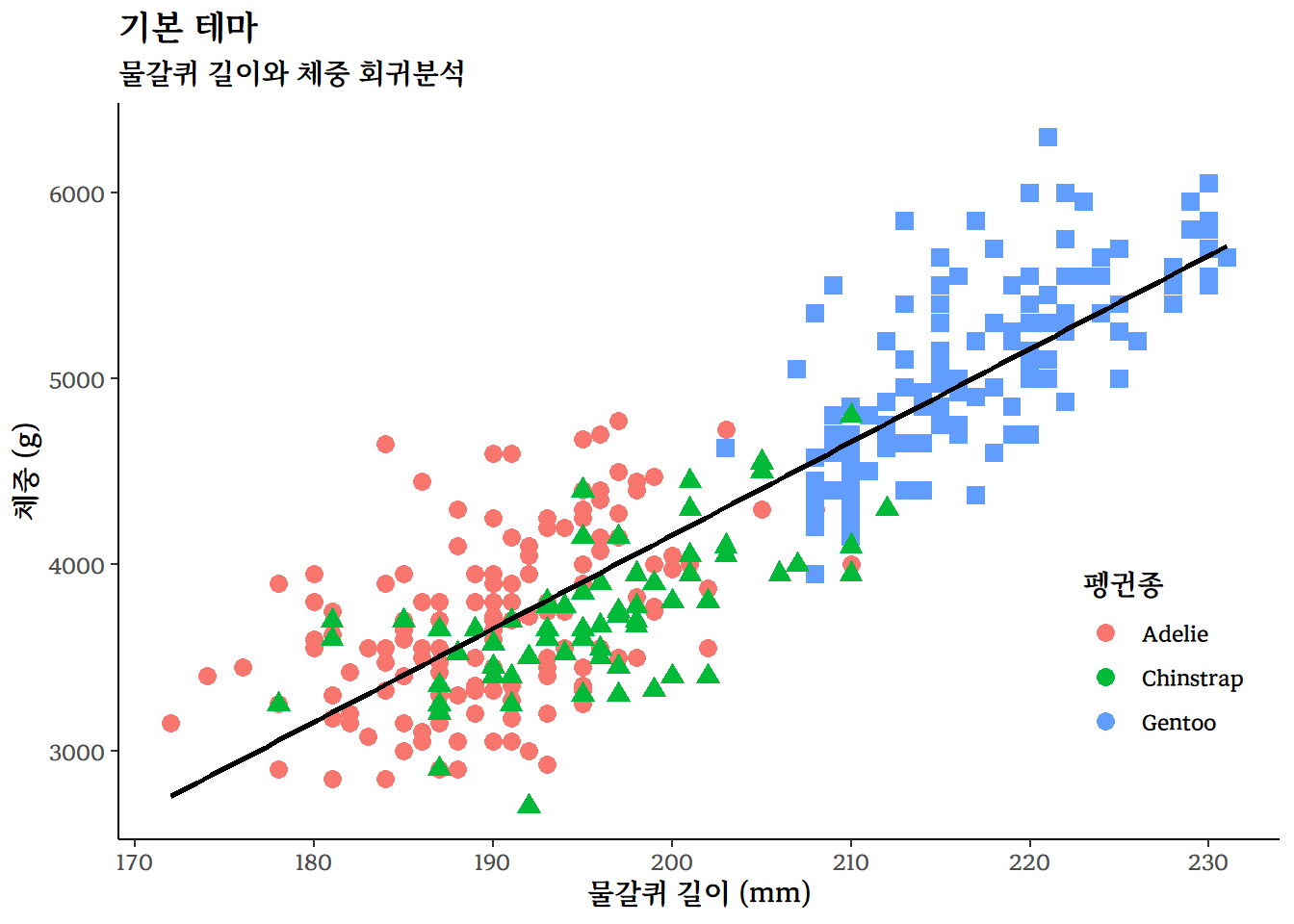
base_penguins_gg <- penguins |>
drop_na() |>
ggplot(aes(x = flipper_length_mm, y = body_mass_g)) +
geom_point(aes(color = species, shape = species), size = 3) +
geom_smooth(method = "lm", se = FALSE, color = "black") +
labs(
title = "기본 테마",
subtitle = "물갈퀴 길이와 체중 회귀분석",
x = "물갈퀴 길이 (mm)",
y = "체중 (g)",
color = "펭귄종",
) +
guides(shape = "none") +
theme_classic(base_family = "MaruBuri-Bold") +
theme(legend.position = c(0.90, 0.25))
base_penguins_gg10 그래프 테마
문서 구성요소 중 하나인 그래프는 데이터를 시각화하여 복잡한 정보를 간결하고 이해하기 쉽게 전달하는데 중요한 역할을 한다. 초기 데이터를 시각화하여 전달할 수 있는 다양한 그래프가 제시되었지만, 너무나 많고 다양한 그래프가 제시되면서 이를 학술적으로 정리한 그래프 문법(grammar of graphics)이 제시되면서 큰 전환점을 맞게 되었다.
SPSS 그래픽이 그 효시로 알려졌고 대략 10년 후 해들리 위컴이 ggplot2 패키지를 개발하여 그래픽 문법을 R에 적용하였다. 이후 ggplot2는 R에서 가장 많이 사용되는 그래픽 패키지로 자리매김하였다. 그래프 문법을 따르는 ggplot2 패키지가 데이터 시각화의 표준으로 자리매김하면서 파이썬에서도 그래프 문법을 따르는 plotnine가 개발되어 그래프 문법을 익히게 되면 R과 파이썬에서 동일한 그래프 문법을 사용하여 데이터 시각화를 할 수 있게 되었다.
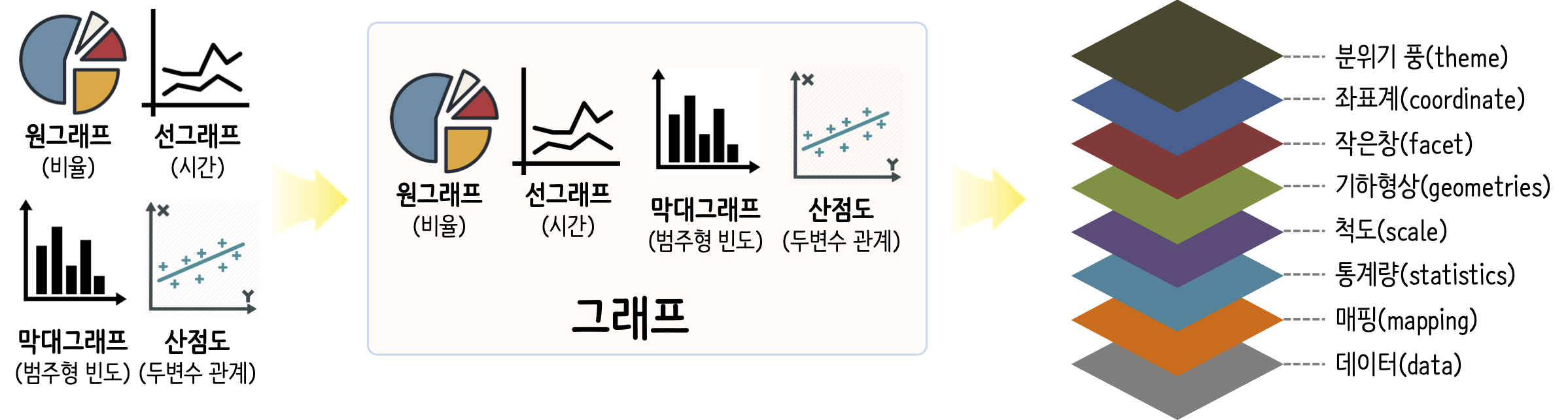
ggplot2는 그래프 문법에 맞춰 데이터프레임을 입력으로 받아 그래프를 생성하는 대표적인 시각화 패키지다. ggplot2에서 기본으로 제공되는 테마(theme)는 9개가 있어, 다양한 테마별로 최소 코딩으로 시각화하고 가장 적합한 그래프 테마를 선정할 수 있다. 먼저, 각 테마를 달리 적용하여 비교할 수 있는 기본 ggplot 그래프를 준비한다.
10.1 내장 테마
ggplot2 패키지에는 다양한 내장 테마가 있으며, 이를 활용하여 데이터를 시각화할 수 있다. palmerpenguins 데이터셋을 사용하여 물갈퀴 길이와 체중 사이의 관계를 앞서 작업한 기본 그래프를 바탕으로 다양한 테마를 적용하여 비교한다.
펭귄 데이터셋을 사용하여 물갈퀴 길이와 체중 사이의 관계를 시각화하는 그래프를 draw_themes() 함수로 테마를 달리 적용하여 ggplot 그래프를 생성한 후에 리스트 객체로 저장한다.
다양한 테마를 draw_themes() 함수에 인자로 넘기기 위해 themes_name과 themes_vector에 테마명과 테마 함수를 저장장 한 후 map2() 함수로 테마를 달리한 ggplot 그래프를 저장한다. 마지막으로, patchwork::wrap_plots() 함수를 사용하여 모든 그래프를 결합하여 하나의 그래프로 출력한다.
draw_themes <- function(theme_name, theme_choice) {
  penguins |>
    ggplot(aes(x = flipper_length_mm, y = body_mass_g)) +
      geom_point(aes(color = species, shape = species), size = 1) +
      geom_smooth(method = "lm", se = FALSE, color = "black")  +
      labs(
        title = theme_name,
        subtitle = "물갈퀴 길이와 체중 회귀분석",
        x = "물갈퀴 길이 (mm)",
        y = "체중 (g)",
        color = "펭귄종",
      ) +
      guides(shape = "none") +
      theme_choice() +
      theme(legend.position = c(0.90, 0.15))
}

## 테마명과 벡터
themes_name <- c("theme_gray", "theme_bw", "theme_linedraw",
                 "theme_light", "theme_dark", "theme_minimal",
                 "theme_classic", "theme_void", "theme_test")

themes_vector <- c(theme_gray , theme_bw , theme_linedraw ,
                  theme_light , theme_dark , theme_minimal , theme_classic ,
                  theme_void , theme_test )

theme_output <- map2(themes_name, themes_vector, draw_themes)

patchwork::wrap_plots(theme_output)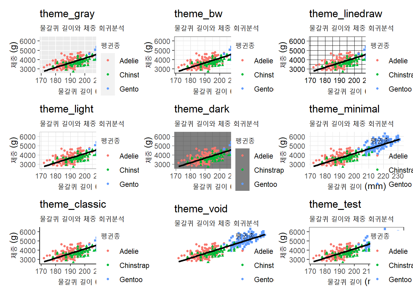
ggplot 내장 기본테마
10.2 hrbrthemes
밥 루디스(Bob Rudis)가 만든 hrbrthemes 패키지는 텍스트가 많은 비즈니스 프레젠테이션에 특히 적합한 테마와 테마 구성 요소를 제공한다. ggplot2 시각화에 세련되고 깔끔한 디자인을 추가해, 데이터 시각화가 더욱 명확하고 전문적으로 보이는 것이 특징이다.
hrbrthemes 패키지는 두 가지 목표를 염두에 두고 있다. 타이포그래피 요소에 중점을 둔 기본테마를 제공하는 것으로 이를 위해서 다양한 레이블의 배치와 글꼴을 포함시켰다. 다른 한가지 목표는 생산성 향상에 중점을 둔다. 시각화 작업결과물은 블로그 게시글, 학술 논문, 프레젠테이션, 내부 보고서, 인쇄출판물 등 출판된다. 시각화 데이터 분석을 진행하는 동안 시각요소가 완벽할 필요는 없다. 작업을 확인하고 지지하는 역할을 하며, 완성된 제품에 대한 출발점에 불과하기 때문이다.
hrbrthemes 패키지에 내장된 바로 사용할 수 있는 다양한 테마를 살펴보자. 먼저, hrbrthemes 패키지를 로드하고, hrbrthemes 테마명과 함수를 리스트에 저장한다. map2 함수를 사용하여 각 테마에 대한 ggplot 객체를 생성한 후, patchwork::wrap_plots 함수로 이들을 하나의 그래프로 결합한다. 이제 한눈에 hrbrthemes 패키지 테마를 적용한 그래프를 시각적으로 비교할 수 있다.
library(hrbrthemes)
hrbr_themes_name <- c("theme_ipsum", "theme_ipsum_ps", "theme_ipsum_es", "theme_ipsum_rc", "theme_ipsum_ps", "theme_ipsum_pub", "theme_ipsum_tw", "theme_modern_rc", "theme_ft_rc")
hrbr_themes_vector <- c(theme_ipsum, theme_ipsum_ps, theme_ipsum_es, theme_ipsum_rc, theme_ipsum_ps, theme_ipsum_pub, theme_ipsum_tw, theme_modern_rc, theme_ft_rc)
hrbr_theme_output <- map2(hrbr_themes_name, hrbr_themes_vector, draw_themes)
hrbrtheme_gg <- patchwork::wrap_plots(hrbr_theme_output)
hrbrtheme_gg
ragg::agg_jpeg("images/hrbrtheme_gg.jpeg",
width = 10, height = 7, units = "in", res = 600)
hrbrtheme_gg
dev.off()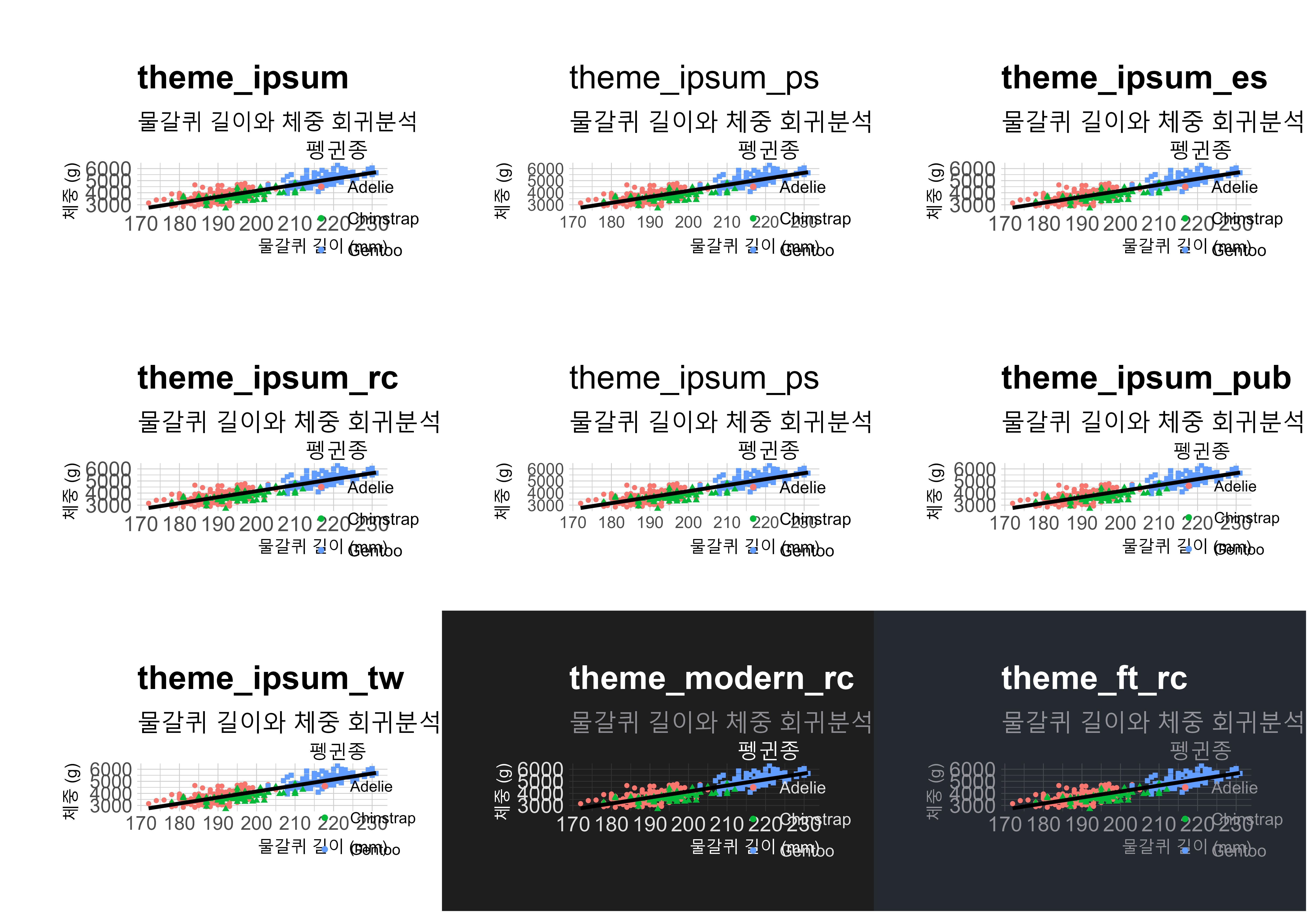 {fig-hrbrtheme-gg}
10.3 ggthemes
제프리 아놀드(Jeffrey Arnold)가 제작한 ggthemes 패키지는 ggplot2를 위한 테마를 제공하는데, 에드워드 터프티(Edward Tufte), 스테픈 퓨(Stephen Few), ‘Fivethirtyeight’, ‘The Economist’, ‘Stata’, ‘Excel’, ‘The Wall Street Journal’ 등의 그래프 스타일을 참조한 것이다. 다양한 출처에서 영감을 받은 테마들은 데이터 시각화를 할 때 더 많은 선택지와 창의성을 제공하고, 사용자가 보다 매력적이고 명확한 시각적 표현을 만들 수 있게 도움을 준다.
ggthemes 패키지에 내장된 바로 사용할 수 있는 다양한 테마를 살펴보자. 먼저, ggthemes 패키지를 로드하고, ggthemes 테마명과 함수를 리스트에 저장한다. map2 함수를 사용하여 각 테마에 대한 ggplot 객체를 생성한 후, patchwork::wrap_plots 함수로 이들을 하나의 그래프로 결합한다. 이제 한눈에 ggthemes 패키지 테마를 적용한 그래프를 시각적으로 비교한다. 테마명에서 유명한 언론사, 소프트웨어, 시각화 유명인을 찾아볼 수 있다.
library(ggthemes)

ggthemes_name <- c("theme_base()","theme_calc()","theme_clean()",
                   "theme_economist()", "theme_economist_white()",
                   "theme_excel()", "theme_excel_new()", "theme_few()",
                   "theme_fivethirtyeight()","theme_foundation()",
                   "theme_gdocs()","theme_hc()","theme_igray()","theme_map()",
                   "theme_pander()","theme_solarized_2()","theme_solid()",
                   "theme_stata()","theme_tufte()","theme_wsj()")

ggthemes_vector <- c(theme_base, theme_calc, theme_clean,
                     theme_economist, theme_economist_white, theme_excel,
                     theme_excel_new, theme_few, theme_fivethirtyeight,
                     theme_foundation, theme_gdocs, theme_hc, theme_igray,
                     theme_map, theme_pander, theme_solarized_2,
                     theme_solid, theme_stata, theme_tufte, theme_wsj)

ggtheme_output <- map2(ggthemes_name, ggthemes_vector, draw_themes)

ggtheme_gg <- patchwork::wrap_plots(ggtheme_output)

ggtheme_gg

ragg::agg_jpeg("images/ggtheme_gg.jpeg",
               width = 10, height = 7, units = "in", res = 600)
ggtheme_gg
dev.off()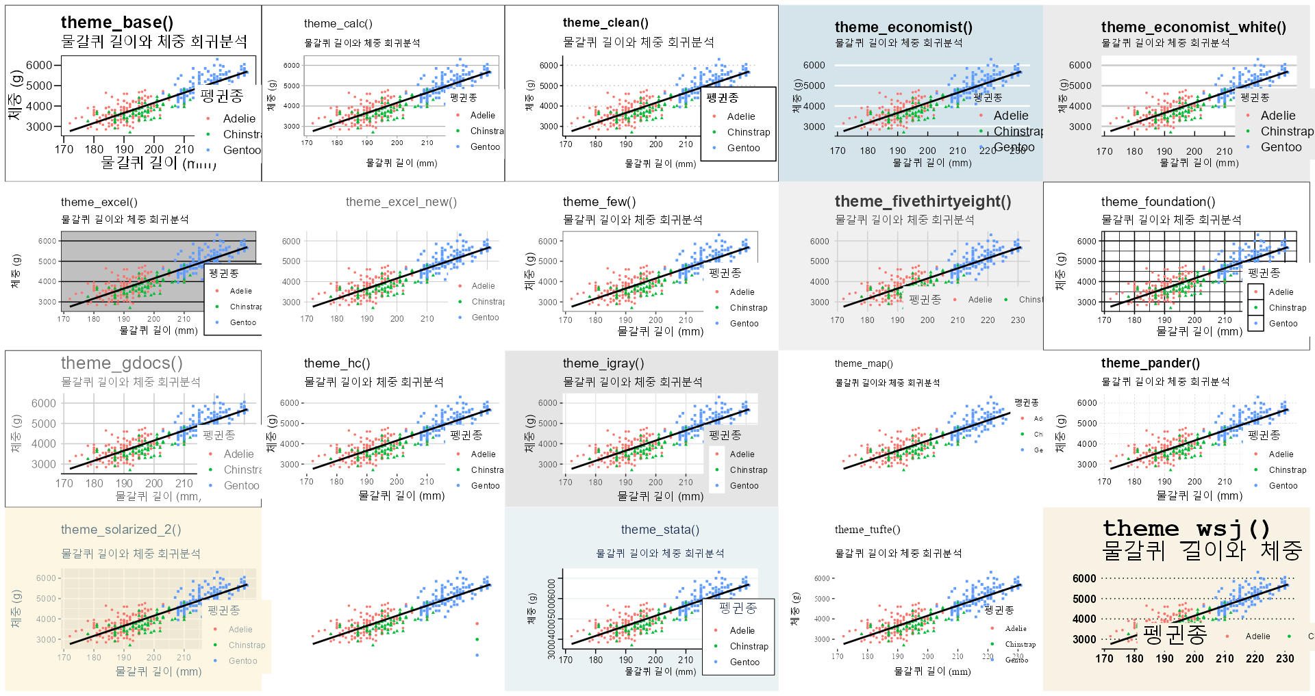
ggthemes 테마 모음
10.4 wesanderson
웨스 앤더슨(Wes Anderson) 영화는 독특하고 눈에 띄는 스타일로 유명하다. 앤더슨 영화 스타일을 기반으로 한 색상 팔레트를 제공하는 R 패키지가 있다. wesanderson 패키지는 웨스 앤더슨 영화의 특징적인 색채와 미적 감각을 반영한 다양한 색상 팔레트를 포함하고 있어, 데이터 시각화에 독창적이고 매력적인 색조를 추가할 수 있다. 사용자는 이 팔레트를 이용하여 그래프나 차트에 독특한 시각적 스타일을 적용할 수 있으며, 이를 통해 데이터 시각화 작업에 예술적인 터치를 가미할 수 있다.
wesanderson 패키지에 내장된 바로 사용할 수 있는 다양한 테마를 살펴보자. 먼저, wesanderson 패키지를 로드하고, wesanderson 테마명과 함수를 리스트에 저장한다. map2 함수를 사용하여 각 테마에 대한 ggplot 객체를 생성한 후, patchwork::wrap_plots 함수로 이들을 하나의 그래프로 결합한다. 이제 한눈에 wesanderson 패키지 테마를 적용한 그래프를 시각적으로 비교한다. 다즐링 주식회사, 그랜드 부다페스트 호텔, 문라이즈 킹덤 등 영화 제목을 색상 팔레트에서 찾아볼 수 있다.
library(wesanderson)

draw_wesanderson <- function(palette_name, wesanderson_palette ="Darjeeling1") {
  penguins |>
    ggplot(aes(x = flipper_length_mm, y = body_mass_g)) +
      geom_point(aes(color = species, shape = species), size = 1) +
      geom_smooth(method = "lm", se = FALSE, color = "black")  +
      labs(
        title = palette_name,
        subtitle = "물갈퀴 길이와 체중 회귀분석",
        x = "물갈퀴 길이 (mm)",
        y = "체중 (g)",
        color = "펭귄종",
      ) +
      guides(shape = "none") +
      theme_minimal() +
      theme(legend.position = "none",
            plot.subtitle  = element_text(family = "MaruBuri", size = 9),
            axis.title.x   = element_text(family = "MaruBuri", size = 7),
            axis.title.y   = element_text(family = "MaruBuri", size = 7)) +
      scale_color_manual(values= wes_palette(wesanderson_palette, n = 3))
}

wes_theme_output <- map2(names(wes_palettes), names(wes_palettes), draw_wesanderson)

wes_theme_gg <- patchwork::wrap_plots(wes_theme_output)

wes_theme_gg +
    theme(legend.position = c(2.1, 0),
          legend.justification = c(1, 0))

ragg::agg_jpeg("images/wes_theme_gg.jpeg",
               width = 10, height = 7, units = "in", res = 600)
wes_theme_gg +
    theme(legend.position = c(2.1, 0),
          legend.justification = c(1, 0))
dev.off()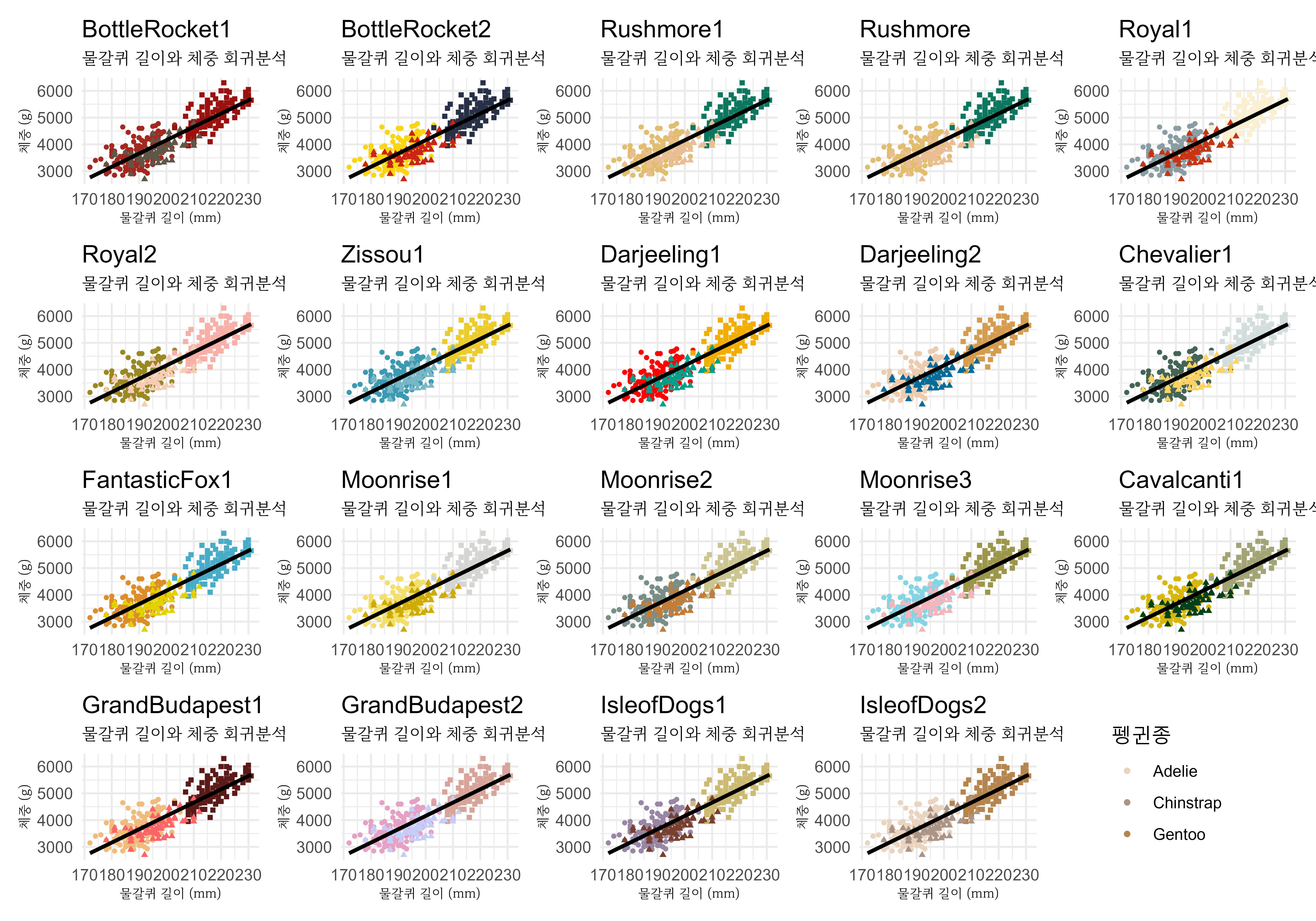
10.5 사용자 테마
설치한 한글 글꼴을 다양한 그래프 요소에 반영한 사용자 맞춤 테마(theme_penguin)을 생성하고 색상은 wesanderson 패키지에서 Darjeeling1 5가지 색상을 사용하여 시각화한다. 생성된 theme_penguin 사용자 정의 테마로 ggplot() 함수를 사용하여 그래프를 만들고, wesanderson 패키지 다즐링 주식회사 Darjeeling1 팔레트 색상을 scale_color_manual() 함수로 반영한다.
extrafont::loadfonts("win")

theme_penguin <- function() {

  theme_minimal() +
  theme(
      plot.title     = element_text(family = "NanumSquare", size = 18, face = "bold"),
      plot.subtitle  = element_text(family = "MaruBuri", size = 13),
      axis.title.x   = element_text(family = "MaruBuri"),
      axis.title.y   = element_text(family = "MaruBuri"),
      axis.text.x    = element_text(family = "MaruBuri", size = 11),
      axis.text.y    = element_text(family = "MaruBuri", size = 11),
      legend.title   = element_text(family = "MaruBuri", size=13),
      plot.caption   = element_text(family = "NanumSquare", color = "gray20")
  )
}

darjeeling1_palette <- wes_palette("Darjeeling1", n = 5)

ggplot_penguins_gg <- penguins |>
  ggplot(aes(x = flipper_length_mm, y = body_mass_g)) +
    geom_point(aes(color = species, shape = species), size = 3) +
    geom_smooth(method = "lm", se = FALSE, color = "black")  +
    labs(
      title = "물갈퀴 길이와 체중 회귀분석",
      subtitle = "남극 파머 펭귄 데이터셋",
      x = "물갈퀴 길이 (mm)",
      y = "체중 (g)",
      color = "펭귄종",
      caption = "자료출처: palmerpenguins 패키지"
    ) +
  guides(shape = "none") +
  scale_color_manual(values =  darjeeling1_palette) +
  theme_penguin()

ggplot_penguins_gg

ggsave("images/ggplot_penguins_gg.png")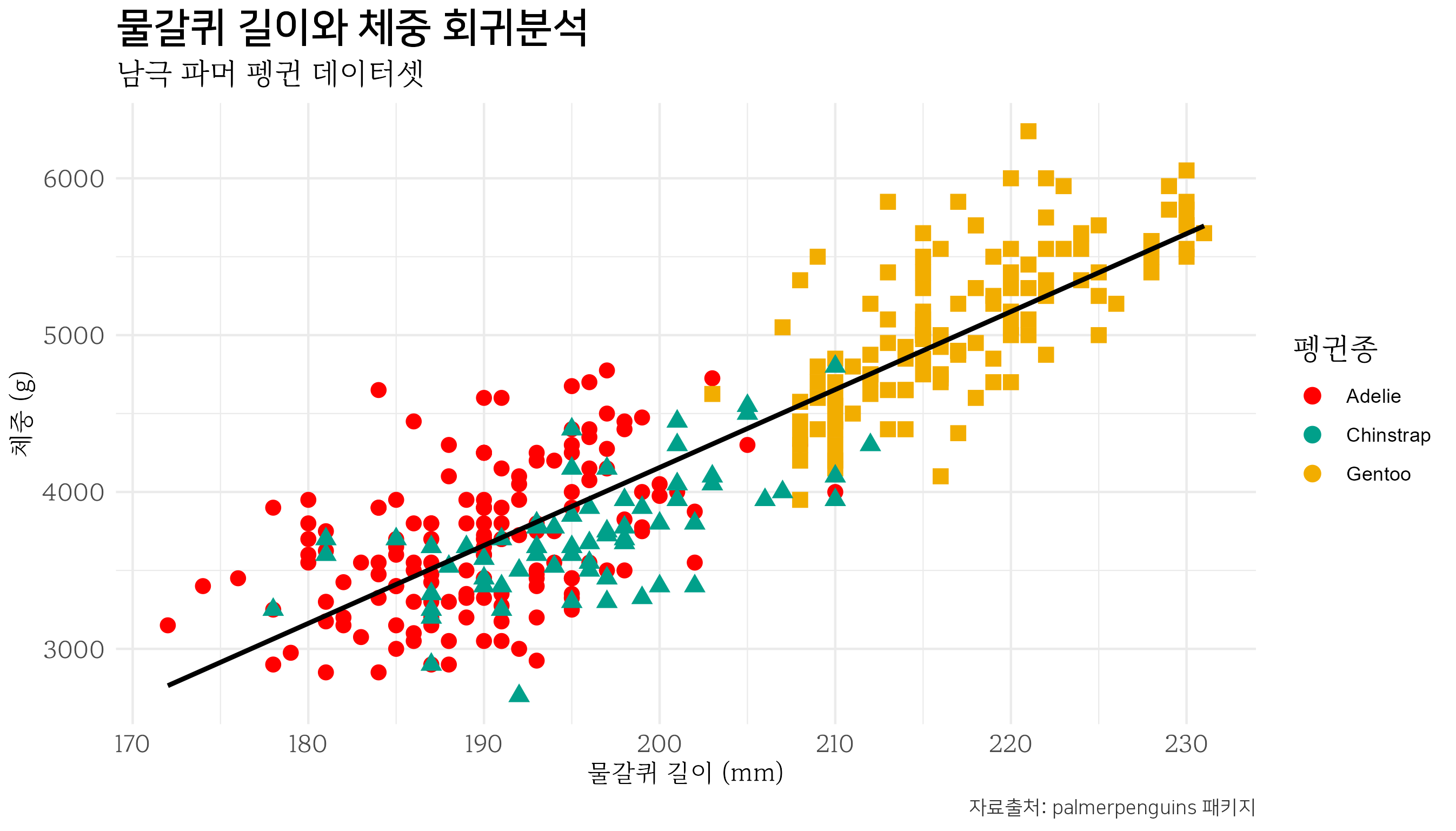
10.6 그래프 자동 설정
작성한 테마를 매번 복사하여 붙여넣지 않고 .Rprofile 파일에 저장해 ggplot 시각화 때마다 자동으로 사용하는 방법을 알아보자. 자동화 작업을 위해 usethis 패키지 edit_r_profile() 함수를 사용한다. 이 함수를 실행시켜면 .Rprofile 파일이 열리고, 앞서 작성한 테마 코드를 추가할 수 있다. 파일에 테마 코드를 추가하고 저장한 후 R 세션을 재시작하면, 매번 ggplot을 사용할 때 자동으로 사용자 정의 테마(theme_penguin)를 불러 사용할 수 있게 되어서 시각화 작업을 더 효율적으로 수행할 수 있다.
usethis::edit_r_profile()theme_penguin() 테마를 ggplot2 패키지 theme_set()으로 설정하고 기본 색상을 정의하면 시각화 그래프에 반영하여 사용할 수 있다.
suppressWarnings(suppressMessages({

  extrafont::loadfonts("win")


  ## 테마 (글꼴) -----------------------------
  theme_penguin <- function() {

    # ggthemes::theme_tufte() +
    ggplot2::theme_minimal() +

      ggplot2::theme(
        plot.title     = element_text(family = "NanumSquare", size = 18, face = "bold"),
        plot.subtitle  = element_text(family = "MaruBuri", size = 13),
        axis.title.x   = element_text(family = "MaruBuri"),
        axis.title.y   = element_text(family = "MaruBuri"),
        axis.text.x    = element_text(family = "MaruBuri", size = 11),
        axis.text.y    = element_text(family = "MaruBuri", size = 11),
        legend.title   = element_text(family = "MaruBuri", size=13),
        plot.caption   = element_text(family = "NanumSquare", color = "gray20")
      )
  }

  ## 색상
  ### 웨스 앤더슨
  color_palette <- wesanderson::wes_palette("Darjeeling1", n = 5)

  ggplot2::theme_set(theme_penguin())

}))
.Rprofile 파일에 ggplot() 사용자 정의 테마가 지정되어 있기 때문에 새로 R 세션을 시작하면 theme_penguin() 테마 및 웨스 앤더스 color_palette 색상 팔레트도 사용할 수 있다.
library(tidyverse)
library(palmerpenguins)

penguins_theme_gg <- penguins |>
  ggplot(aes(x = flipper_length_mm, y = body_mass_g)) +
    geom_point(aes(color = species, shape = species), size = 3) +
    geom_smooth(method = "lm", se = FALSE, color = "black")  +
    labs(
      title = "물갈퀴 길이와 체중 회귀분석",
      subtitle = "남극 파머 펭귄 데이터셋",
      x = "물갈퀴 길이 (mm)",
      y = "체중 (g)",
      color = "펭귄종",
      caption = "자료출처: palmerpenguins 패키지"
    ) +
  guides(shape = "none") +
  scale_color_manual(values =  color_palette) +
  theme_penguin()

ragg::agg_jpeg("images/penguins_theme_gg.jpg",
              width = 10, height = 7, units = "in", res = 600)
penguins_theme_gg
dev.off()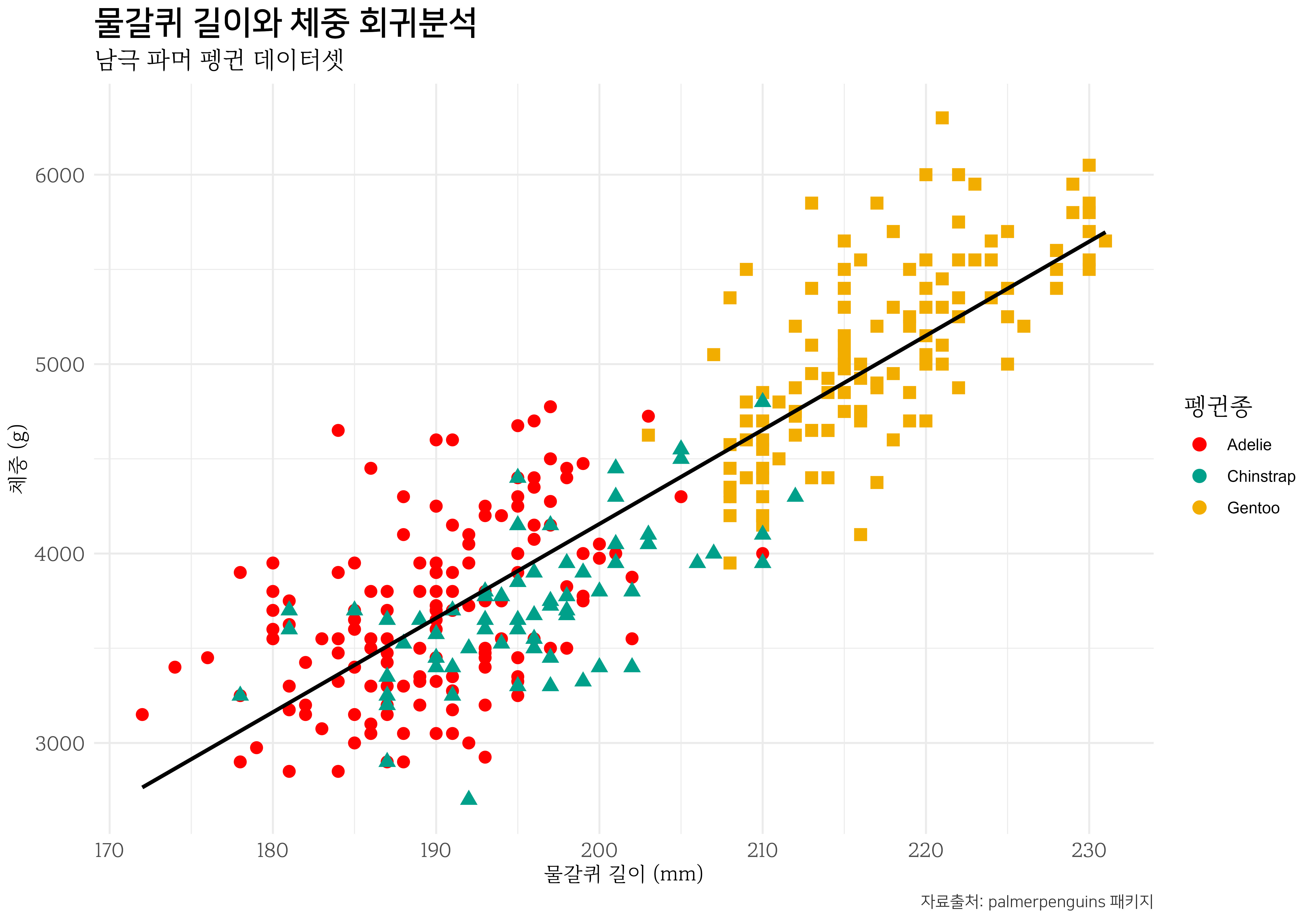
연습문제
객관식
-
ggplot2패키지에서 기본으로 제공되는 테마의 수는 몇 개인가요?- 5개
- 7개
- 9개
- 11개
-
hrbrthemes패키지의 주요 특징은 무엇인가요?- 데이터 시각화의 창의성 강화
- 타이포그래피 요소에 중점
- 빠른 시각화 속도
- 다양한 색상 옵션 제공
-
wesanderson패키지는 어떤 특징을 가지고 있나요?- 고전적인 그래프 스타일 제공
- 웨스 앤더슨 영화 스타일의 색상 팔레트
- 최적화된 시각화 속도
- 데이터 처리 기능
서술형
-
ggplot2의 기본 테마와 사용자 정의 테마를 적용하는 방법에 대해 설명해보세요.
- 데이터 시각화에 다양한 테마를 적용하는 것이 왜 중요한가요?