graph TD
A[나무위키 <br> 크롤링]
A --> C[데이터 전처리<br>데이터프레임]
C --> E[Billboard API]
C --> F[데이터 시각화<br> ggplot + gt]
F --> G[대시보드<br>Quarto 문서 작성]
E --> G
G --> I[gh-pages 배포]
챗GPT 데이터 시각화
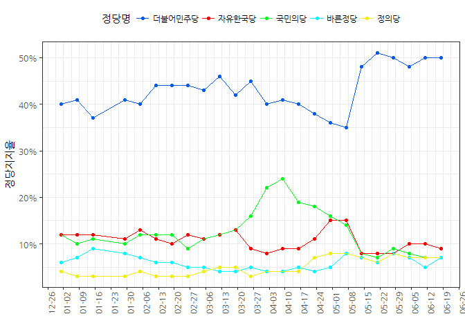
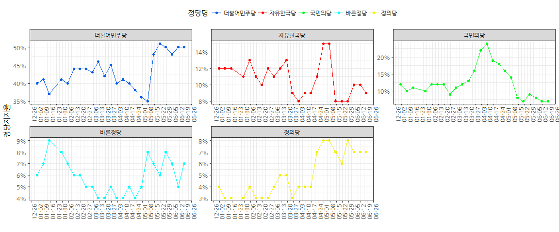
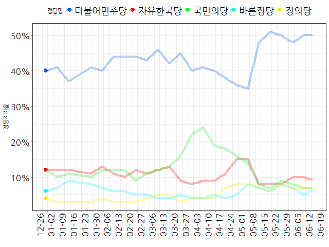
데이터 시각화 어디까지 보고 오셨어요?
2024년 6월 25일
서울 R 미트업 (2023년)


서울 R 미트업

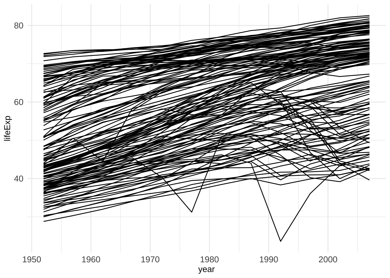
정적 그래프
애니메이션 - 2017년 버전
로고 + 막대그래프
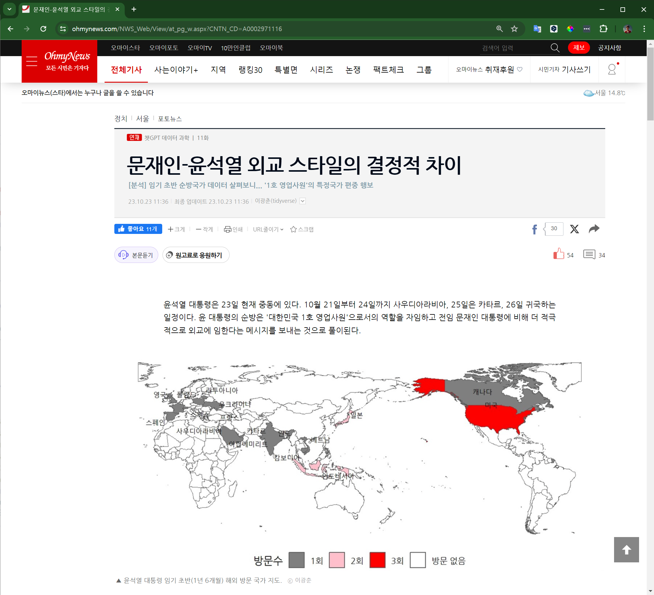
문 대통령 해외순방
library(tidyverse)
library(rvest)
moon_html <- read_html("https://ko.wikipedia.org/wiki/문재인의_대통령_순방_목록")
moon_raw <- moon_html |>
html_elements("table") |>
html_table()
moon_h3 <- moon_html |>
html_elements("h3") |>
html_text()
names(moon_raw) <- moon_h3[1:6]
moon_tbl <- moon_h3 |>
enframe() |>
mutate(연도 = str_remove(value, "년\\[편집\\]")) |>
filter(str_detect(연도, "\\d{4}")) |>
mutate(data = moon_raw[c(1:5)]) |>
unnest(data) |>
select(연도, 나라, 장소, 일자, 세부내용=`세부 내용`) |>
separate(일자, into = c("출국", "도착"), sep = "~") |>
mutate(도착 = ifelse(is.na(도착), 출국, 도착)) |>
mutate(출국일 = str_glue("{연도}-{출국}"),
도착일 = str_glue("{연도}-{도착}")) |>
mutate(출국일 = parse_date(출국일, "%Y-%m월 %d일"),
도착일 = parse_date(도착일, "%Y-%m월 %d일")) |>
select(출국일, 도착일, 국가 = 나라, 장소) |>
mutate(기간 = (출국일 %--% 도착일) / ddays(1) +1)
moon_tbl |> slice(1:5) |> gt::gt()| 출국일 | 도착일 | 국가 | 장소 | 기간 |
|---|---|---|---|---|
| 2017-06-28 | 2017-07-03 | 미국 | 워싱턴 D.C. | 6 |
| 2017-07-05 | 2017-07-08 | 독일 | 베를린, 함부르크 | 4 |
| 2017-09-06 | 2017-09-07 | 러시아 | 블라디보스토크 | 2 |
| 2017-09-19 | 2017-09-21 | 미국 | 뉴욕 | 3 |
| 2017-11-08 | 2017-11-10 | 인도네시아 | 자카르타 | 3 |
library(countrycode)
library(gt)
library(gtExtras)
country_codes <- data.frame(
"국가" = c("노르웨이", "뉴질랜드", "덴마크", "독일", "라오스", "러시아", "말레이시아", "미국", "미얀마", "바티칸 시국", "베트남", "벨기에", "브루나이", "사우디아라비아", "스웨덴", "스페인", "싱가포르", "아랍에미리트", "아르헨티나", "영국", "오스트레일리아", "오스트리아", "우즈베키스탄", "이집트", "이탈리아", "인도", "인도네시아", "일본", "조선민주주의인민공화국", "중화인민공화국", "체코", "카자흐스탄", "캄보디아", "태국", "투르크메니스탄", "파푸아뉴기니", "프랑스", "핀란드", "필리핀", "헝가리"),
"영문_국가명" = c("Norway", "New Zealand", "Denmark", "Germany", "Laos", "Russia", "Malaysia", "United States", "Myanmar", "Vatican City", "Vietnam", "Belgium", "Brunei", "Saudi Arabia", "Sweden", "Spain", "Singapore", "United Arab Emirates", "Argentina", "United Kingdom", "Australia", "Austria", "Uzbekistan", "Egypt", "Italy", "India", "Indonesia", "Japan", "North Korea", "China", "Czech Republic", "Kazakhstan", "Cambodia", "Thailand", "Turkmenistan", "Papua New Guinea", "France", "Finland", "Philippines", "Hungary"),
"iso2c" = c("NO", "NZ", "DK", "DE", "LA", "RU", "MY", "US", "MM", "VA", "VN", "BE", "BN", "SA", "SE", "ES", "SG", "AE", "AR", "GB", "AU", "AT", "UZ", "EG", "IT", "IN", "ID", "JP", "KP", "CN", "CZ", "KZ", "KH", "TH", "TM", "PG", "FR", "FI", "PH", "HU")
)
moon_tbl |>
group_by(국가) |>
summarise(방문수 = n(),
연도 = str_c(str_glue("{lubridate::year(출국일)}"), collapse = ",")) |>
left_join(country_codes, by = "국가") |>
mutate(대륙 = countrycode(iso2c, "iso2c", "continent")) |>
arrange(desc(방문수)) |>
select(-영문_국가명) |>
select(iso2c, everything()) |>
filter(대륙 %in% c("Americas", "Oceania")) |>
gt(groupname_col = "대륙") |>
fmt_flag(columns = iso2c) |>
cols_label(
iso2c = ""
) |>
cols_align("center") |>
tab_header(
title = md("문재인 대통령 해외 순방"),
subtitle = md("2017년 5월 10일 ~ 2021년 5월 9일")
) |>
tab_footnote(
footnote = md("데이터 출처: [위키백과](https://ko.wikipedia.org/wiki/문재인의_대통령_순방_목록)")
) |>
gt_theme_538() |>
## 표 전체 합계 -------------------------------------
grand_summary_rows(
columns = 방문수,
fns = list(label = "", fn = "sum"),
fmt = ~ fmt_integer(.),
side = "bottom"
)| 문재인 대통령 해외 순방 | ||||
|---|---|---|---|---|
| 2017년 5월 10일 ~ 2021년 5월 9일 | ||||
| 국가 | 방문수 | 연도 | ||
| Americas | ||||
| 미국 | 8 | 2017,2017,2018,2018,2019,2019,2021,2021 | ||
| 아르헨티나 | 1 | 2018 | ||
| Oceania | ||||
| 뉴질랜드 | 1 | 2018 | ||
| 오스트레일리아 | 1 | 2021 | ||
| 파푸아뉴기니 | 1 | 2018 | ||
| — | — | 12 | — | |
| 데이터 출처: 위키백과 | ||||
library(viridis); library(sf); sf_use_s2(FALSE)
moon_tour <- moon_tbl |> group_by(국가) |>
summarise(방문수 = n(),
연도 = str_c(str_glue("{lubridate::year(출국일)}"), collapse = ",")) |>
left_join(country_codes, by = "국가")
world_map <- rnaturalearth::ne_countries(scale = 50, returnclass = "sf")
country_centroid <- inner_join(st_centroid(world_map), moon_tour,
by = c("iso_a2" = "iso2c"))
country_centroid <- bind_cols(country_centroid,
st_coordinates(country_centroid) |>
as_tibble() |> set_names(c("lon", "lat")))
moon_map <- left_join(world_map, moon_tour, by = c("iso_a2" = "iso2c"))
moon_map |>
filter(continent != "Antarctica") |>
mutate(방문수 = factor(방문수, levels = c(1, 2, 8),
labels = c("1회", "2회", "8회"))) |>
ggplot() +
geom_sf(aes(fill = 방문수)) +
scale_fill_manual(values = c("gray50", "skyblue", "blue"),
na.value = "transparent",
breaks = c("1회", "2회", "8회", NA),
labels = c("1회", "2회", "8회", "방문 없음")) +
labs(title = "문재인 대통령 해외순방") +
theme_void(base_family = "NanumGothic") +
theme(legend.position = "bottom") +
ggrepel::geom_text_repel(
data = country_centroid |> select(국가, lon, lat) |> st_drop_geometry(),
aes(label = 국가, x = lon, y = lat), size = 3, segment.size = 0.2)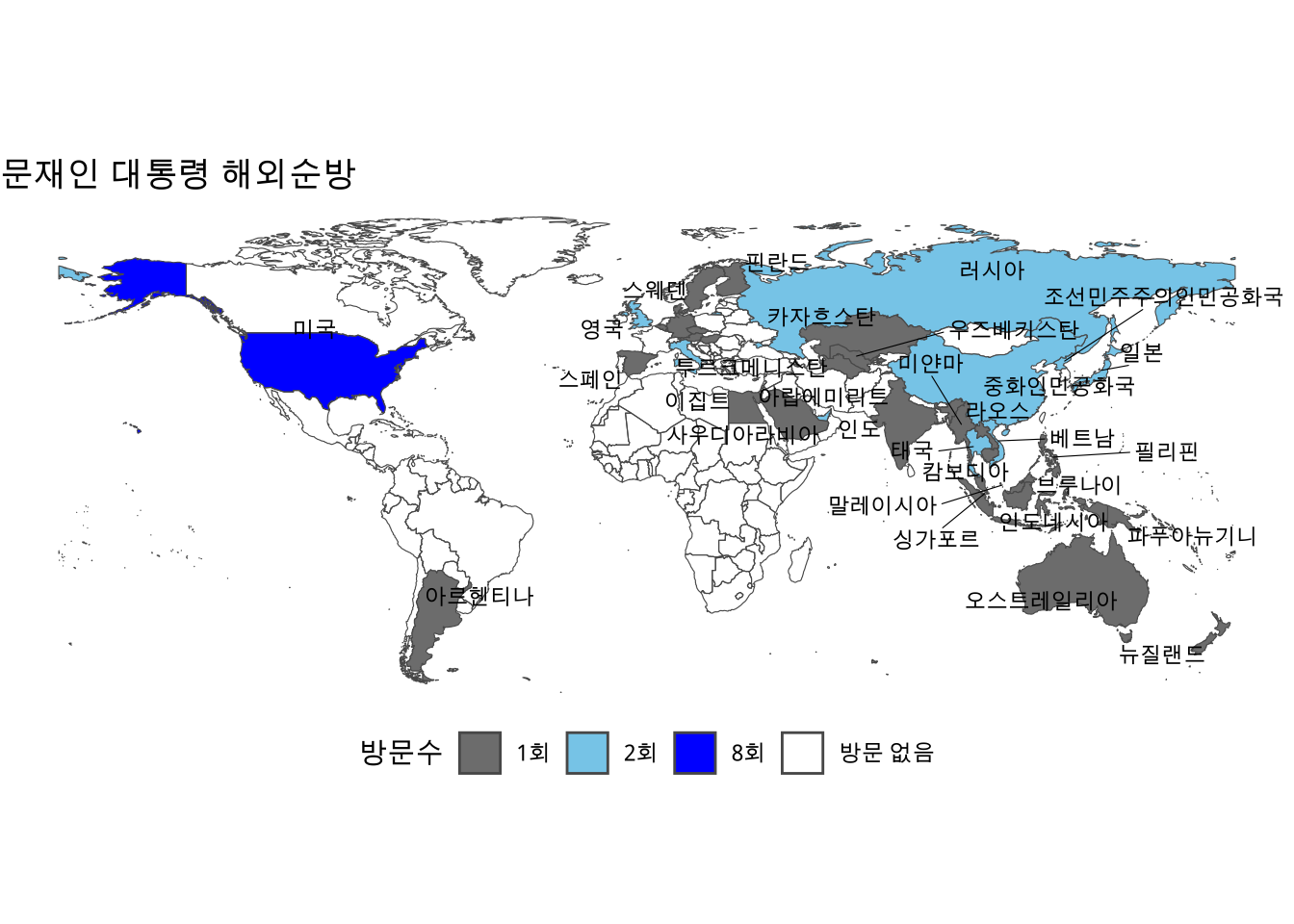
offset <- 180 - 150
polygon <- st_polygon(x = list(rbind(
c(-0.0001 - offset, 90), c(0 - offset, 90),
c(0 - offset, -90), c(-0.0001 - offset, -90),
c(-0.0001 - offset, 90) ))) %>%
st_sfc() %>% st_set_crs(4326)
world_pacific <- world_map |>
st_difference(polygon) |> st_transform(crs = "+proj=eqc +x_0=0 +y_0=0 +lat_0=0 +lon_0=150")
moon_pacific_map <- left_join(world_pacific, moon_tour, by = c("iso_a2" = "iso2c"))
pacific_centroid <- inner_join(st_centroid(moon_pacific_map), moon_tour, by = c("iso_a2" = "iso2c"))
pacific_country_centroid <- bind_cols(pacific_centroid,
st_coordinates(pacific_centroid) |> as_tibble() |> set_names(c("lon", "lat")))
moon_pacific_map |>
mutate(방문수 = factor(방문수, levels = c(1, 2, 8), labels = c("1회", "2회", "8회"))) |>
ggplot() +
geom_sf(aes(fill = 방문수)) +
scale_fill_manual(values = c("gray50", "skyblue", "blue"),
na.value = "transparent",
breaks = c("1회", "2회", "8회", NA),
labels = c("1회", "2회", "8회", "방문 없음")) +
theme_void(base_family = "NanumGothic") +
theme(legend.position = "bottom") +
ggrepel::geom_text_repel(
data = pacific_country_centroid |> select(국가.x, lon, lat) |> st_drop_geometry(),
aes(label = 국가.x, x = lon, y = lat), size = 3, segment.size = 0.2)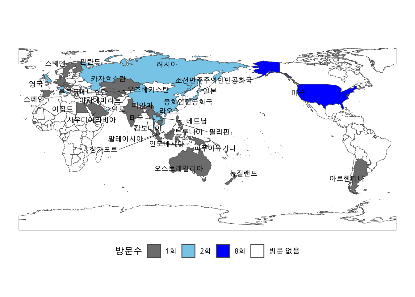
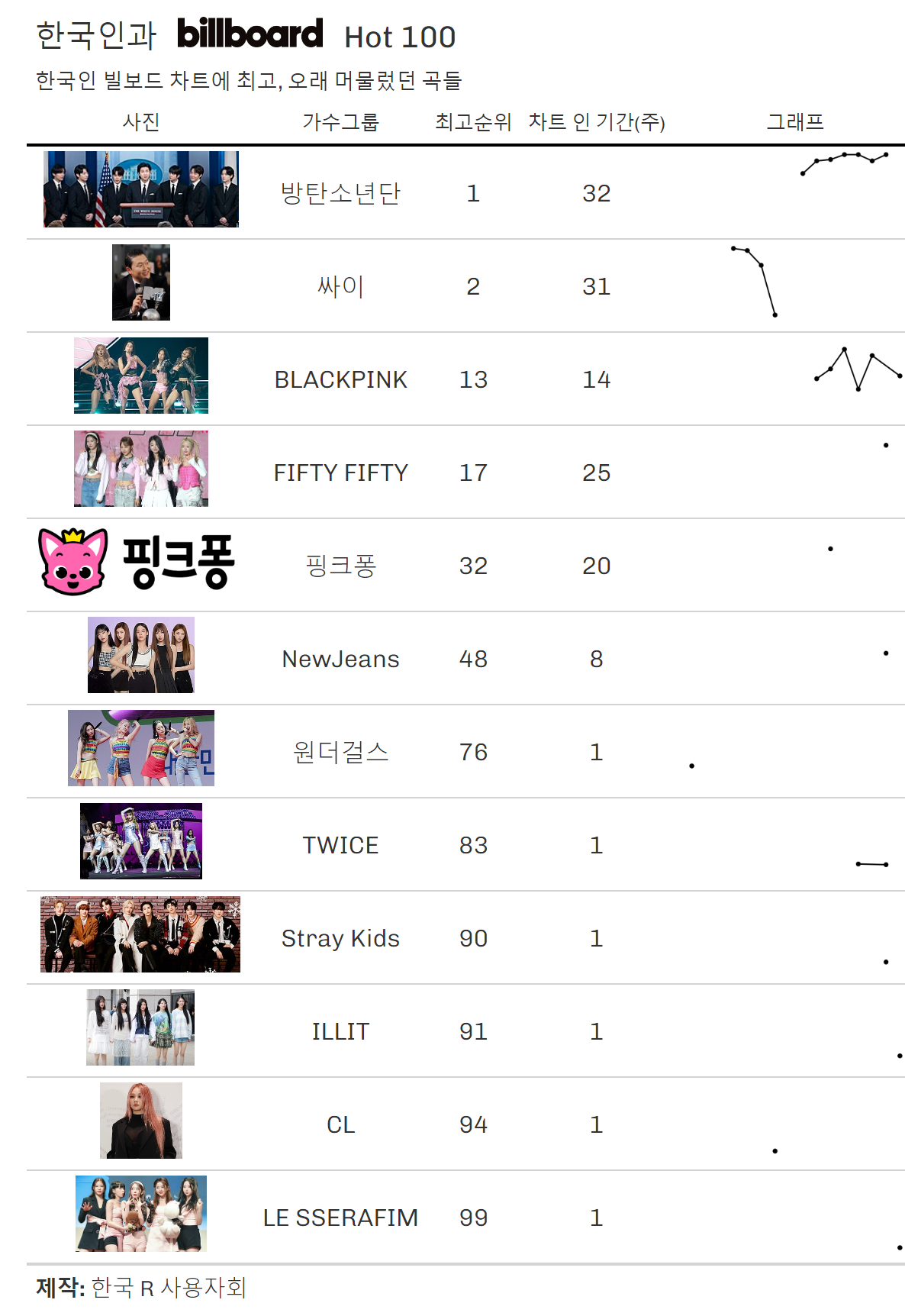
K-POP 빌보드 HOT 100
OpenAI Advanced Data Analysis
Open AI Code Interpreter → Advanced Data Analysis → 챗GPT4

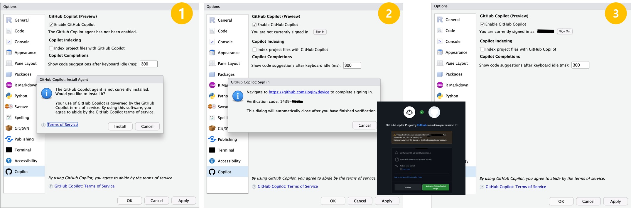
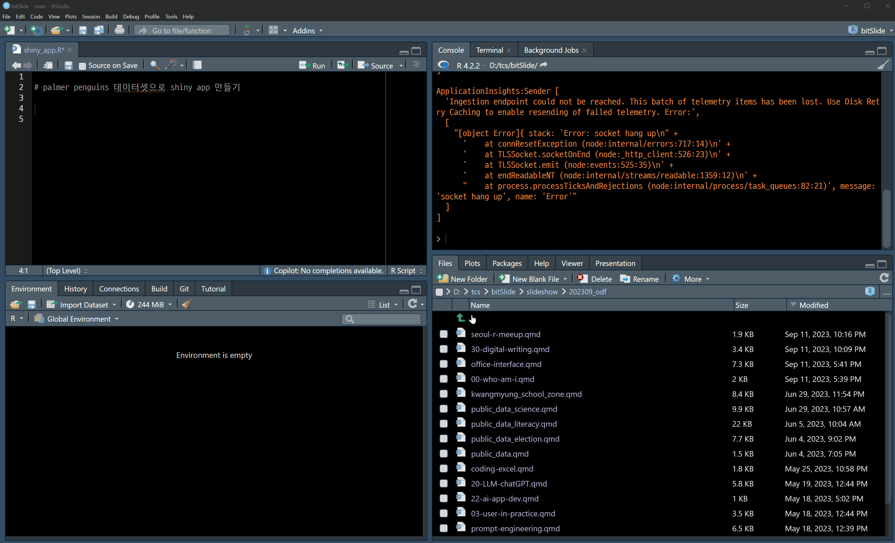
RStudio Copilot
Tools -> Global Options -> Copilot -> Enable Github Copilot
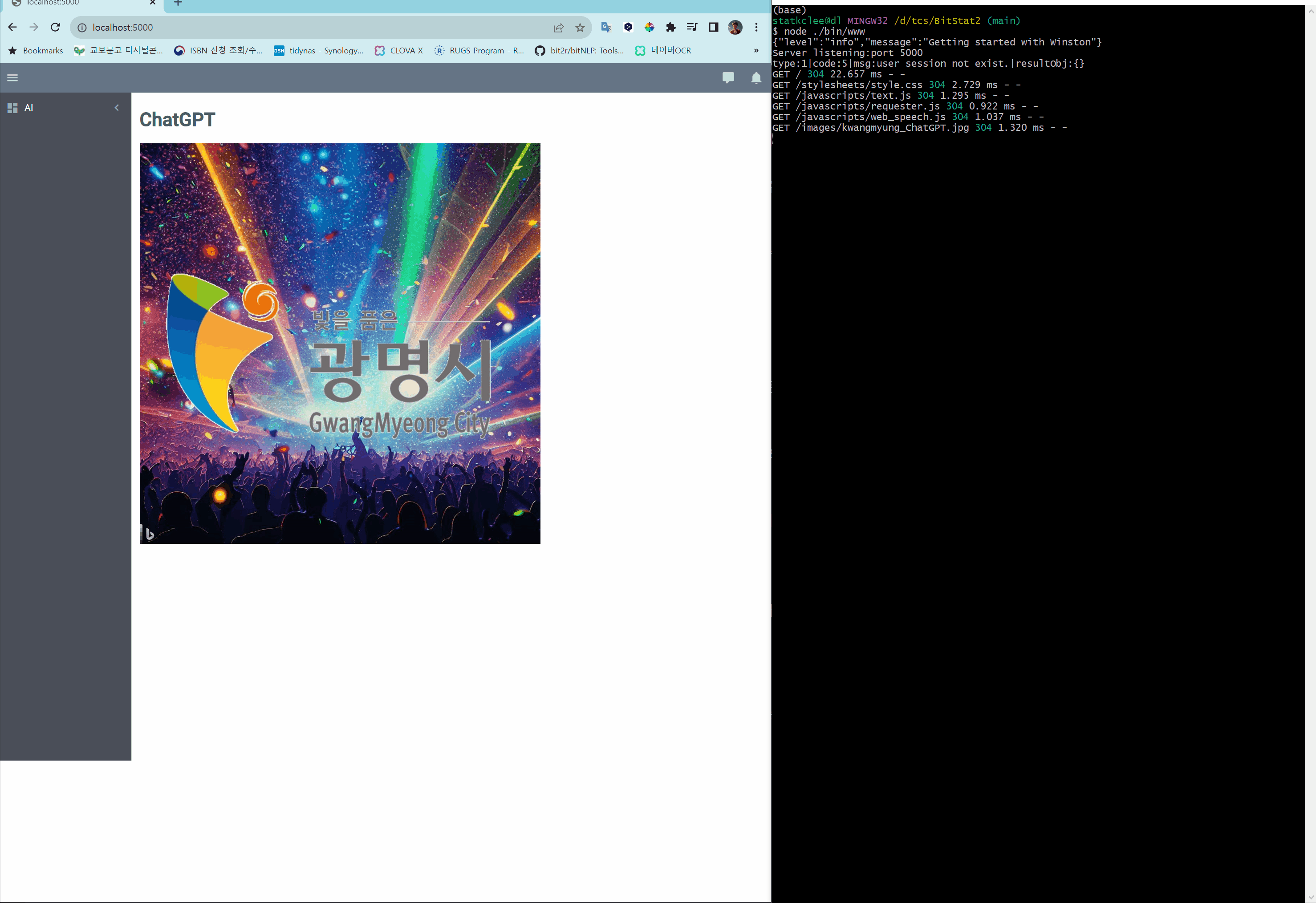
웹앱(Shiny App) 개발 사례
광명시 보좌관
RTutor & PandasAI

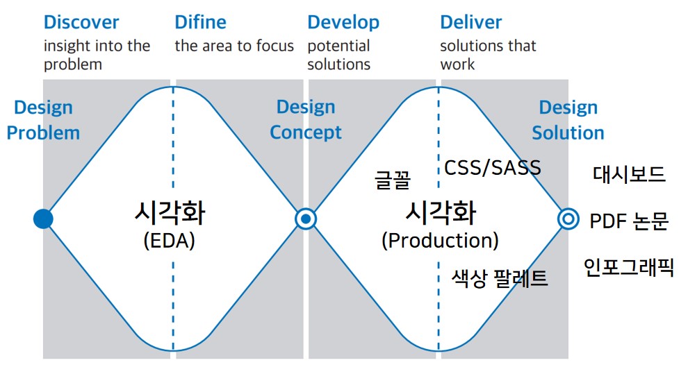
더블 다이아몬드

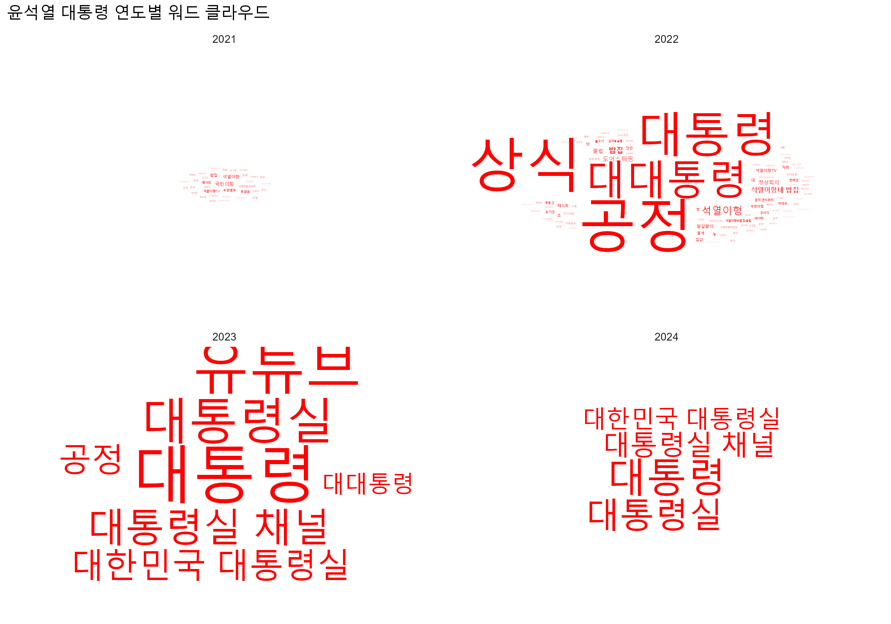
워드 클라우드
지도
library(bitSpatial)
bitSpatial::admi |>
select(base_ym, mega_nm, cty_nm, admi_nm, geometry)
#> Simple feature collection with 3528 features and 4 fields
#> Geometry type: GEOMETRY
#> Dimension: XY
#> Bounding box: xmin: 124.6117 ymin: 33.11238 xmax: 130.9401 ymax: 38.61369
#> Geodetic CRS: WGS 84
#> # A tibble: 3,528 × 5
#> base_ym mega_nm cty_nm admi_nm geometry
#> <chr> <chr> <chr> <chr> <POLYGON [°]>
#> 1 202306 서울특별시 종로구 사직동 ((126.9771 37.5758, 126.9744 37.57607, 1…
#> 2 202306 서울특별시 종로구 삼청동 ((126.9736 37.59327, 126.9756 37.58968, …
#> 3 202306 서울특별시 종로구 부암동 ((126.9772 37.59865, 126.9711 37.60078, …
#> 4 202306 서울특별시 종로구 평창동 ((126.98 37.62828, 126.975 37.62903, 126…
#> 5 202306 서울특별시 용산구 한남동 ((127.0057 37.5477, 127.0043 37.5502, 12…
#> 6 202306 서울특별시 성동구 왕십리2동 ((127.0336 37.56263, 127.0268 37.56496, …
#> 7 202306 서울특별시 성동구 마장동 ((127.0381 37.57227, 127.0322 37.57009, …
#> 8 202306 서울특별시 중구 중림동 ((126.9709 37.55937, 126.9695 37.56198, …
#> 9 202306 서울특별시 성동구 옥수동 ((127.0154 37.54825, 127.0131 37.55005, …
#> 10 202306 서울특별시 중구 장충동 ((127.0096 37.56303, 127.0012 37.56286, …
#> # ℹ 3,518 more rows
참고문헌
이광춘. (2018). 데이터 과학자의 시각화. 데이터야 놀자 컨퍼런스. https://statkclee.github.io/ds-authoring/ds_data_scientist_visualization.html
이현진. (2024). 데이터 드리븐 디자인 (1판 ed). 출판 진행중.
![]()