12 . 시각화 패턴
12.1 라벨 붙은 시계열
시계열 데이터를 제작하게 되면 추세를 파악할 수 있지만 결국 그래서 가장 최근 값이 어떻게 되는지 관심이 많다.
이런 사용자 요구를 맞추는데 시계열 데이터 마지막 시점에 라벨값을 붙이게 되면 가독성도 좋아진다.
기본적인 작업흐름은 데이터셋에서 가장 최근 관측점을 뽑아서 별도 데이터프레임으로 저장하고
이를 geom_text() 혹은 geom_text_repel() 함수를 사용해서 해결한다.
BLOGR 님이 작성한 Label line ends in time series with ggplot2 코드를 참조하여 ggplot으로 코드를 작성한다.
## 마지막 관측점
orange_ends <- datasets::Orange %>%
  group_by(Tree) %>%
  filter(age == max(age)) %>%
  ungroup()

datasets::Orange %>%
  ## 범례와 그래프 순서 맞추기 위해 범주 순서 조정
  mutate(Tree = fct_reorder(Tree, -circumference) ) %>%
  ggplot(aes(age, circumference, color = Tree)) +
    geom_line(size = 2, alpha = .8) +
    scale_x_continuous(label=scales::comma, limits = c(0, 1600)) +
    ## 마지막 관측점 라벨과 큰 점 추가
    geom_text(data = orange_ends, aes(label = circumference, color = NULL), hjust = -0.5,) +
    geom_point(data = orange_ends, aes(x=age, y= circumference), size = 3.7) +
    theme_minimal(base_family = "MaruBuri") +
    labs(title = "오렌지 나무 성장곡선",
         subtitle = "R 내장된 Orange 데이터셋",
         x = "일별 경과 시간", y = "직경 (mm)",
         caption = "제작: 한국 R 사용자회",
         color = "나무")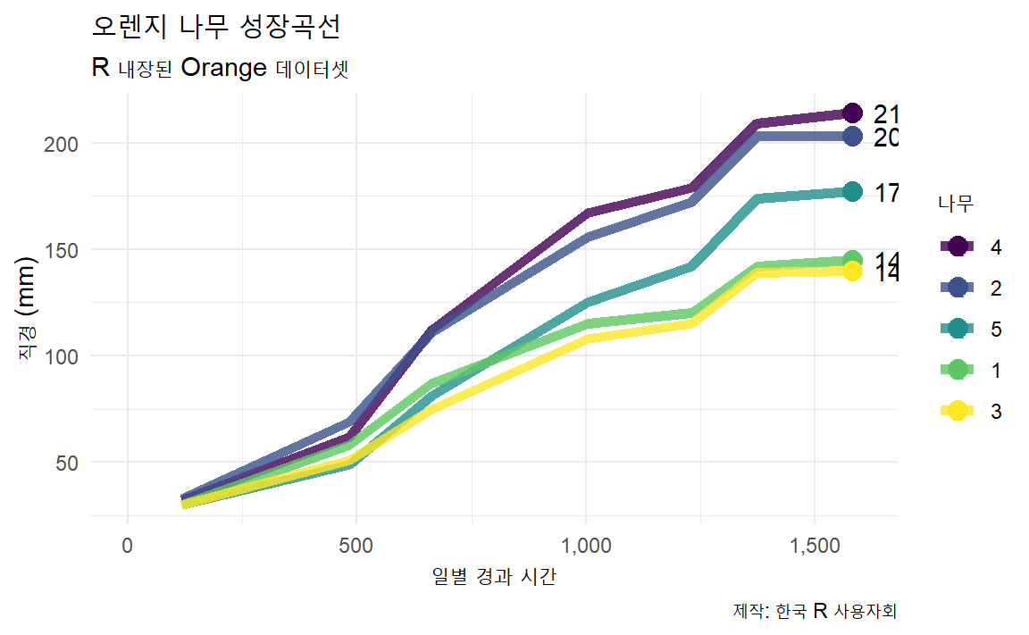
12.2 막대그래프 그룹별 색상
RStudio를 거쳐 IBM에서 근무하고 있는 Alison Presmanes Hill 의 GitHub 저장소에 공개된 TV 시리즈 데이터를 사용해서 막대그래프를 작성할 때 그룹별 색상을 적용하여 가시성을 높인다. TV 시리즈별 색상을 달리할 경우 RColorBrewer 패키지 생상 팔레트를 범주형에 맞춰 각 시리즈별로 가장 잘 구분될 수 있도록 색상을 칠해 시각화를 한다.
ratings <- read_csv("http://bit.ly/cs631-ratings",
                    na = c("", "NA", "N/A"))

# 데이터 준비
ratings_bonanza1 <- ratings %>%
  mutate(ep_id = row_number(),
         series = as.factor(series)) %>%
  select(ep_id, viewers_7day, series)

# 시각화
barplot_pal <- RColorBrewer::brewer.pal(n=8, name = "Accent")

ratings_bonanza1 %>%
  ggplot(aes(x = ep_id, y = viewers_7day, fill = series)) +
    geom_col(alpha = .9) + # 막대그래프
    theme_minimal(base_family = "MaruBuri") +
    theme(legend.position = "bottom",
          text = element_text(family = "Lato"),
          axis.text.x = element_blank(),
          axis.ticks.x = element_blank(),
          axis.title.x = element_blank()) +
    ## 시즌별 다른 색상 팔레트 적용
    scale_fill_manual(values = barplot_pal) +
    scale_x_continuous(expand = c(0, 0)) +
    guides(fill = guide_legend(nrow = 1)) + # 범례 한줄 정렬
    labs( title = "8번째 시즌 폭망했음!!",
          subtitle= "전시즌, 회차별 시청자수",
          fill = "시즌",
y = "7일 시청자수") 
12.3 추세선 강조 + 라벨
시각화의 백미는 아무래도 대조와 비교를 통해 강한 인상을 주는 것이다.
앞선 ratings TV 시리즈 시청자 평가 데이터를 대상으로 추세선에 강조를 넣고 라벨 텍스트도 넣어
하이라이트 강조 그래프를 작성해보자.
geom_line()을 두개 포함시켜 강조하고하는 색상을 별도로 지정하고 선굵기도 달리한다.
라벨도 동일한 방법으로 geom_text()를 두개 포함시켜 강조하고자하는 색상과 글꼴크기도 달리 지정한다.
ratings %>%
  mutate(episode = as.factor(episode)) %>%
  ggplot(aes(x = episode, y = viewers_7day, group = series)) +
    geom_line(data = filter(ratings, !series == 8), alpha = .25) +
    ## 기존 그려진 선에 굵은 선과 색상을 달리하여 차별화한다.
    geom_line(data = filter(ratings, series == 8), color = "#CF2154", size = 1.5) +
    theme_minimal(base_family = "MaruBuri") +
    labs(x = "에피소드", y="1주일 시청자수", title="여덟번째 스리즈가 문제네!!!") +
    geom_text(data = filter(ratings, episode == 1 & series %in% c(1:7)), color = "gray50",
              aes(label = paste0(series, " 회차 ")), vjust = -1, family = "MaruBuri") +
    ## 8회차 텍스트 반대위치에 크기를 달리하고 글꼴도 달리하여 라벨 추가
    geom_text(data = filter(ratings, episode == 10 & series == 8), color = "#CF2154",
              aes(label = glue::glue("{series} 회차")), vjust = -1, family = "Nanum Pen Script",
              size = 7)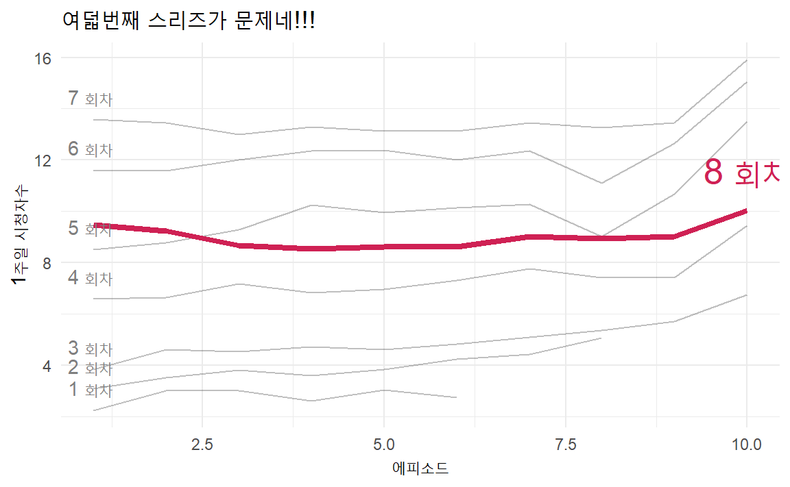
12.4 롤리팝(lolli-pop) 그래프
롤리팝(Lollipop) 사탕 그래프는 막대그래프와 클리블랜드 점그래프를 합성한 것으로 한축에는 연속형, 다른 한축에는 범주형을 두고 사용자의 관심을 점그래프로 집중시키는데 효과적이다. 단순히 막대그래프를 제작하는 것과 비교하여 임팩트있는 시각화를 가능하게 한다.
제작순서는 막대그래프 → 점그래프 → 롤리팝 그래프로 뼈대 골격을 만들어 나간다.
대략 골격이 제작되고 나면 외양과 필요한 경우 값도 텍스트로 넣어 시각화 제품을 완성한다.
롤리팝 사탕 그래프를 작성할 때 geom_point()를 사용해서 롤리팝 사탕을 제작하고,
geom_sgement() 함수를 사용해서 사탕 막대를 그린다. 이때 막대 사탕의 시작과 끝을
시작은 x, y에 넣어주고 끝은 xend와 yend에 넣어 마무리한다.
데이터는 ggplot2에 내장된 midwest 데이터를 사용하자. midwest 데이터셋은
2000년 미국 중서부 센서스 데이터로 인구통계 조사가 담겨있다.
percollege 변수는 카운티(우리나라 군에 해당) 별 대학졸업비율을 나타낸다.
# 데이터 -----
## 롤리팝 사탕 그래프를 위해 상위 15개 군만 추출
ohio_top15 <- ggplot2::midwest %>%
        filter(state == "OH") %>%
        select(county, percollege) %>%
        ## 대졸자 비율이 높은 카운티 15개 선정
        top_n(15, wt = percollege) %>%
        ## 시각화를 위해 오름차순 정렬
        arrange(percollege) %>%
        ## 문자형 자료를 범주형으로 변환
        mutate(county = factor(county, levels = .$county))

ohio_barplot_g <- ohio_top15 %>%
  ggplot(aes(county, percollege)) +
    geom_col(width = 0.5) +
    coord_flip() +
    labs(title = "막대그래프",
         y = "대졸비율(%)",
         x = "")

ohio_dotplot_g <- ohio_top15 %>%
  ggplot(aes(county, percollege)) +
    geom_point() +
    coord_flip() +
    labs(title = "점그래프",
         y = "대졸비율(%)",
         x = "")

ohio_lollipop_g <- ohio_top15 %>%
  ggplot(aes(county, percollege)) +
    geom_point() +
    geom_segment(aes(x = county, xend = county,
                     y = 0, yend = percollege), color = "grey50") +
    coord_flip() +
    labs(title = "롤리팝 사탕 그래프",
         y = "대졸비율(%)",
         x = "")

cowplot::plot_grid(ohio_barplot_g, ohio_dotplot_g, ohio_lollipop_g, nrow=1)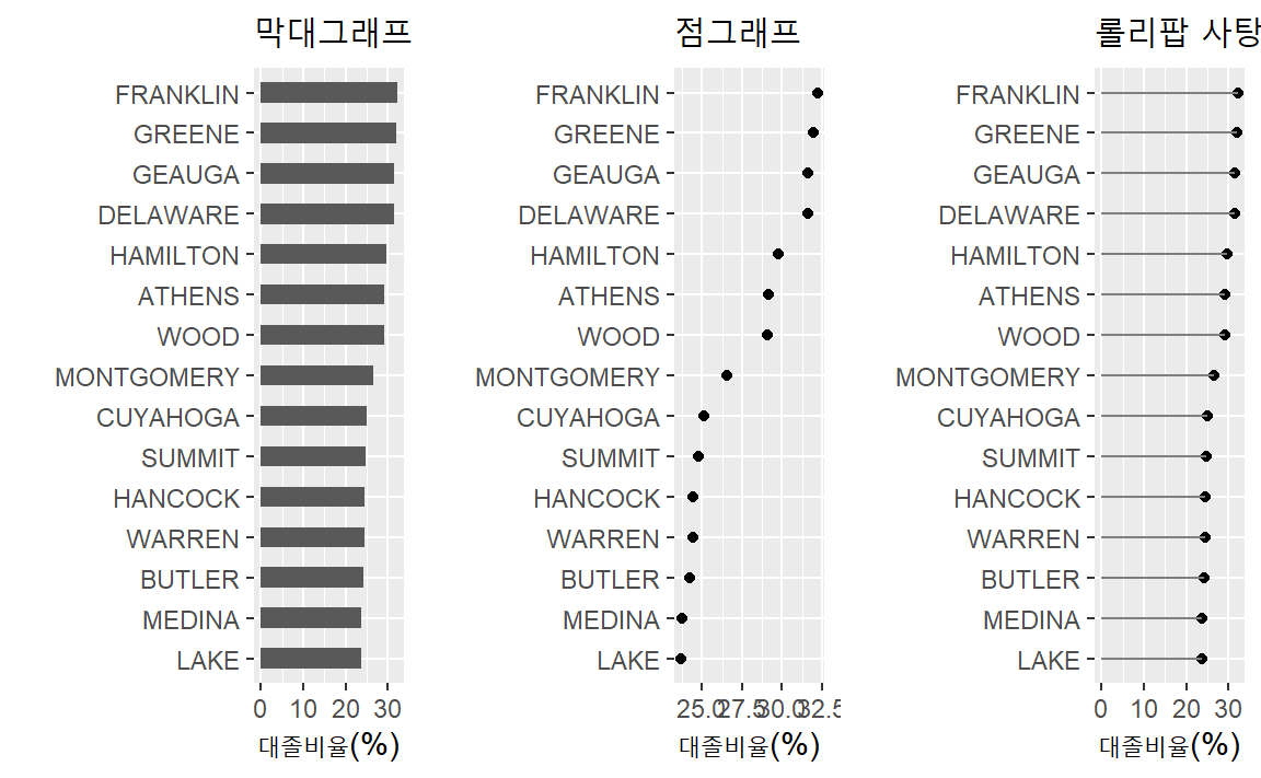
한발더 나아가, 평균값에서 얼마나 차이가 있느냐를 롤리팝 그래프로 시각화하는 패턴이 많이 사용된다. 이를 위해서, 앞서와 마찬가지로 15개 카운티를 뽑아내고 평균을 구하고 평균이상, 평균이하에 대한 요인(factor)도 함께 만들어낸다. 반영한다.
## 평균기준 대졸비율 비교를 위한 데이터셋 준비
ohio <- midwest %>%
        filter(state == "OH") %>%
        select(county, percollege) %>%
        top_n(15, wt=percollege) %>%
        arrange(percollege) %>%
        mutate(Avg = mean(percollege, na.rm = TRUE),
               Above = ifelse(percollege - Avg > 0, TRUE, FALSE),
               county = factor(county, levels = .$county))

## 시각화 기본 골결 제작
comparison_lollipop_g <- ohio %>%
  ggplot( aes(percollege, county, color = Above) ) +
        geom_segment(aes(x = Avg, y = county,
                         xend = percollege, yend = county), color = "grey50") +
        geom_point()

## 외양과 설명을 넣어 가시성을 높임
ohio %>%
  ggplot( aes(percollege, county, color = Above, label=round(percollege,1)) ) +
    geom_segment(aes(x = Avg, y = county,
                     xend = percollege, yend = county), color = "grey50") +
    geom_point(size=7) +
    annotate("text", x = 27.5, y = "WOOD", label = "평균이상", color = "#00BFC4", size = 5, hjust = -0.1, vjust = 5) +
    annotate("text", x = 27.5, y = "WOOD", label = "평균이하", color = "#F8766D", size = 5, hjust = +1.1, vjust = -1) +
    geom_text(color="black", size=3) +
    theme_minimal(base_family = "MaruBuri") +
    labs(x="대졸 비율(%)", y="",
         title="오하이오주 카운티별 대졸비율 비교")  +
    geom_segment(aes(x = 27.5, xend = 27.5 , y = "WOOD", yend = "WARREN"), size=1,
                 arrow = arrow(length = unit(0.2,"cm")), color = "#00BFC4") +
    geom_segment(aes(x = 27.5, xend = 27.5 , y = "MONTGOMERY", yend = "DELAWARE"), size=1,
                 arrow = arrow(length = unit(0.2,"cm")), color = "#F8766D") +
    theme(legend.position = "none")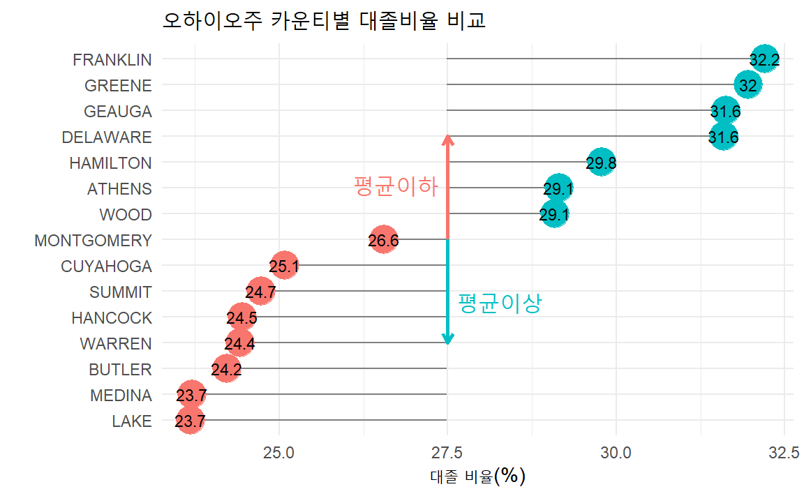
12.5 아령(dumbbell) 그래프
두시점을 비교하여 전후를 비교한다던가 두 지역을 비교할 때 아령 그래프는 매우 효과적이다.
TV 시리즈별로 회차를 달리하여 첫번째와 가장 마지막 시청자수를 비교하여 시각화하는데 아령(dumbbell) 그래프가 적절한 예시가 될 것으로 보인다. 이를 위해서 ggplot()에 들어가는 자료형을 미리 준비하고 이에 맞춰 geom_line()과 geom_point()를 결합시켜 시각화한다.
ratings_dumbbell_df <- ratings %>%
  select(series, episode, viewers_7day) %>%
  group_by(series) %>%
  filter(episode == 1 | episode == max(episode)) %>%
  mutate(episode = ifelse(episode == 1,"1회차", "최종회")) %>%
  ungroup() %>%
  mutate(series = as.factor(series))

# RColorBrewer::display.brewer.all() 색상
dumbbell_pal <- RColorBrewer::brewer.pal(n=3, name="Set1")

ratings_dumbbell_df %>%
  ggplot(aes(x = viewers_7day, y = fct_rev(series), color = episode, group = series)) +
    geom_line(size = .75) +
    geom_point(size = 2.5) +
    theme_minimal() +
    scale_color_manual(values = dumbbell_pal) +
    labs(title = "아령 그래프 사례",
         subtitle = "첫번째와 마지막 TV 시리즈를 에피소드별로 비교",
         y = "시즌", x = "시청자수 (백만명)",
         color = "회차") +
    theme(text = element_text(family = "MaruBuri"),
          legend.position = "top")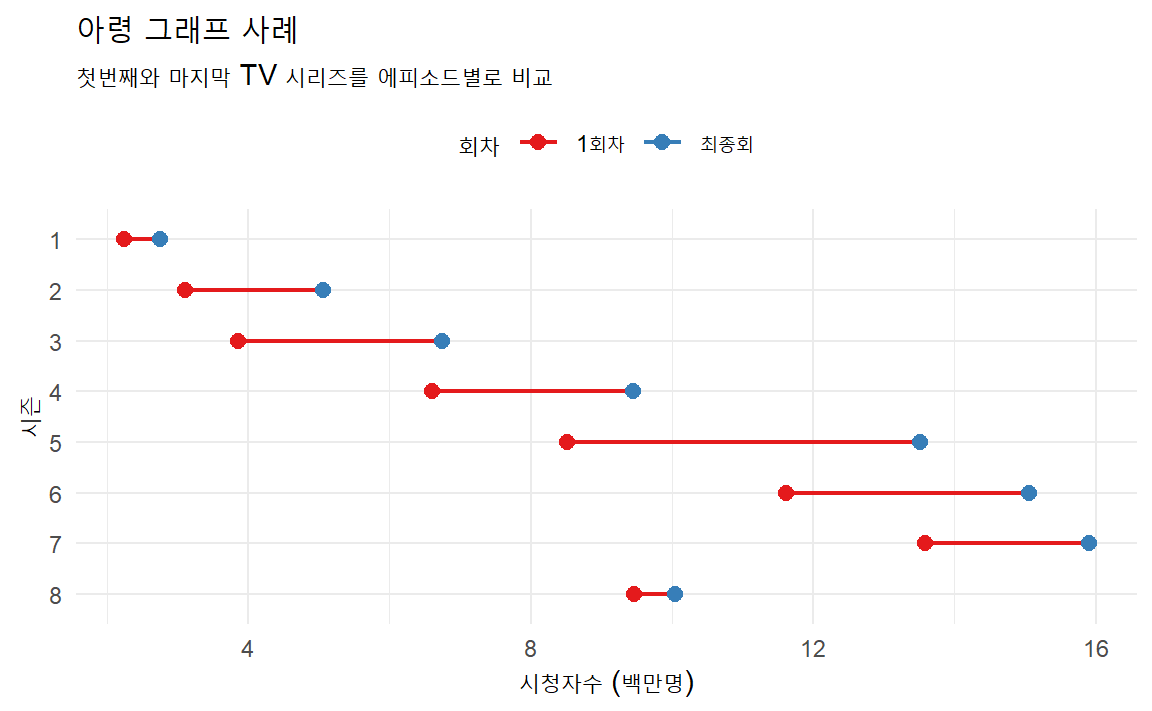
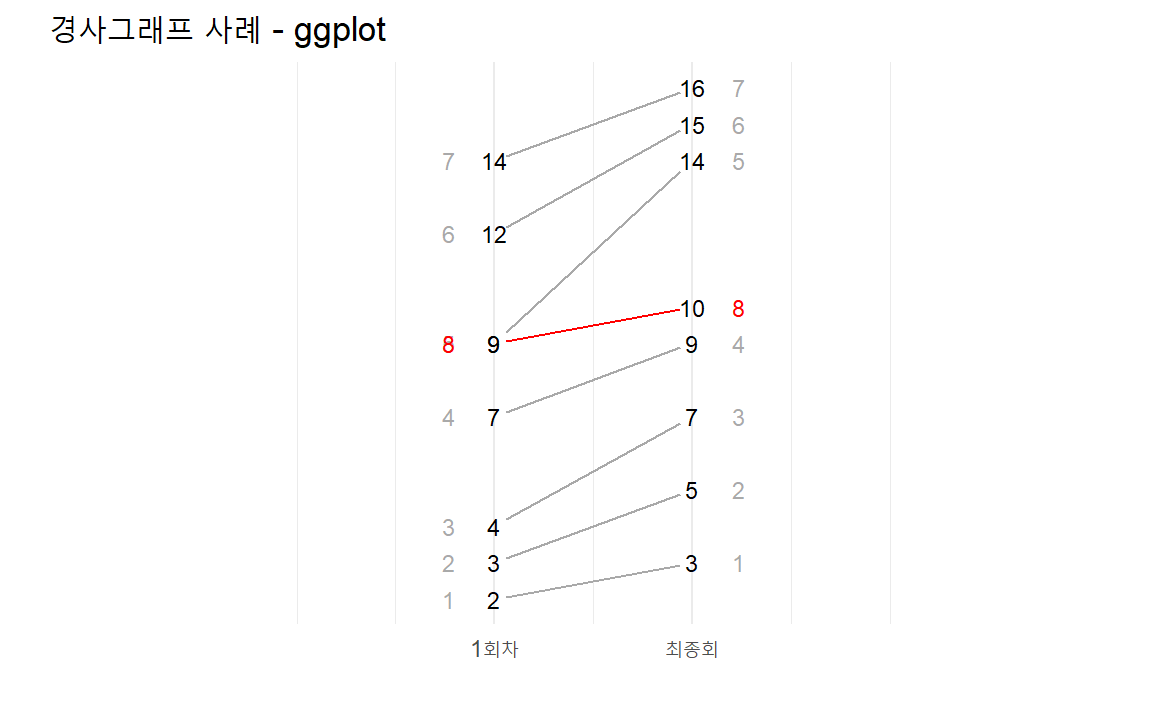
12.6 경사(Slope) 그래프
아령 그래프를 제작한 동일한 데이터를 터프티(tufte) 스타일 경사그래프로 구현하면
시즌별 첫회와 최종회 시청자수 비교를 좀더 직관적으로 만들 수 있다.
ggplot의 기본기능을 활용하여 경사그래프를 시각화하고 강조하고자 하는 시즌을
색상을 달리하여 표현한다. 이를 통해 1~7번째 시즌은 1회차 시청율은 낮으나 최종회는 높게
마무리된 것을 알 수 있고, 더불어 시즌이 진행될 수록 1회차 시청율도 높아지고 있었다.
하지만 8번째 시즌은 다른 시즌과 달리 낮게 시작했고 최종회 시청률도 크게 나아지지 않은 것을
한눈에 파악할 수 있다.
ratings_dumbbell_df %>%
  ggplot(aes(x = episode, y = viewers_7day, group = series)) +
    geom_point(data = filter(ratings_dumbbell_df, !series == 8), alpha = .25) +
    geom_point(data = filter(ratings_dumbbell_df, series == 8), color = "#CF2154") +
    geom_line(data = filter(ratings_dumbbell_df, !series == 8), alpha = .25) +
    geom_line(data = filter(ratings_dumbbell_df, series == 8),color = "#CF2154") +
    theme_minimal(base_family = "MaruBuri") +
    labs(title = "경사그래프(Slopegraph) 사례", x="에피소드", y="주별 시청자수 (단위: 백만)") +
    ## 8번째 시즌
    geom_text(data = filter(ratings_dumbbell_df, episode == "최종회" & series %in% c(1:7)), color = "gray",
              aes(label = series), vjust = -1, family = "Nanum Pen Script", hjust = .5) +
    geom_text(data = filter(ratings_dumbbell_df, episode == "최종회" & series == 8), color = "#CF2154",
              aes(label = paste0(series, " 시즌")), vjust = -1, family = "Nanum Pen Script", size=5) +
    ## 1~7번째 시즌
    geom_text(data = filter(ratings_dumbbell_df, episode == "1회차" & series %in% c(1:7)), color = "gray50",
aes(label = paste0(series, " 시즌")), family = "MaruBuri", hjust = 1.2) 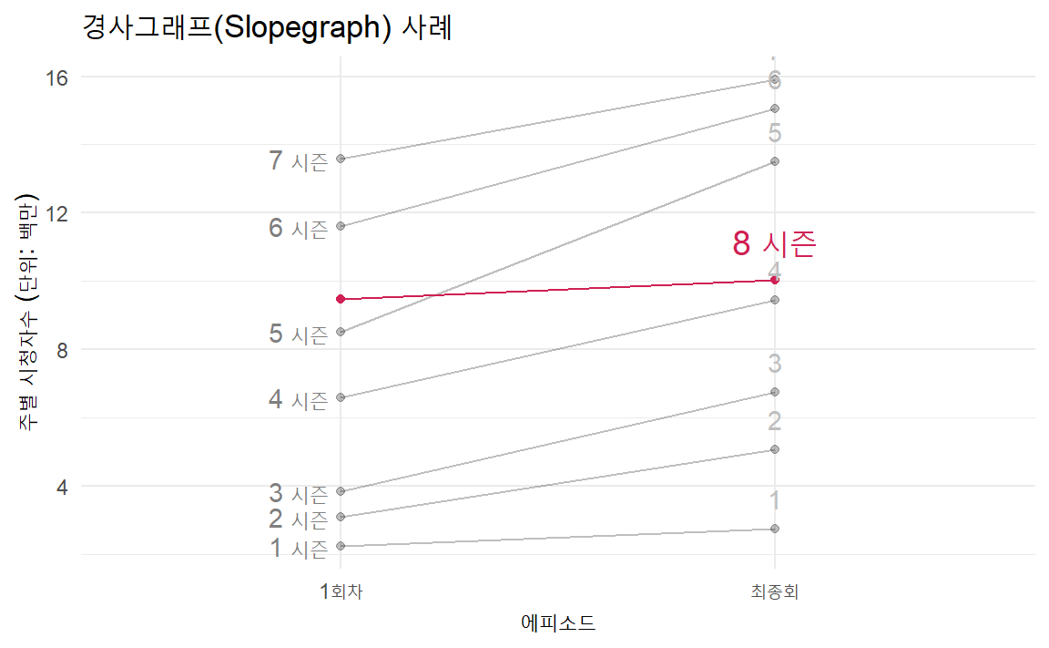
경사그래프를 제작하고는 싶으나 전반적으로 시간이 더 필요하신 분을 위해
slopegraph 패키지가 있다.
slopegraph는 Base 그래픽을 기본으로 삼고 있어 자료구조도 rownames를 갖는 전통적인 데이터프레임이다.
기본 Base 그래픽을 염두에 두고 상기 TV 연속물 경사그래프를 다음과 같이 작성할 수 있다.
# devtools::install_github("leeper/slopegraph")
library(slopegraph)

series_cols <- c(rep("darkgray", 7), "red")

ratings_dumbbell_df %>%
  spread(episode, viewers_7day) %>%
  as.data.frame() %>%
  column_to_rownames(var="series") %>%
  slopegraph(., col.lines = series_cols, col.lab = series_cols,
            cex.lab = 1.5, cex.num = 1.0,
            xlim = c(-0.5, 3.5),
            xlabels = c('첫회','최종회'))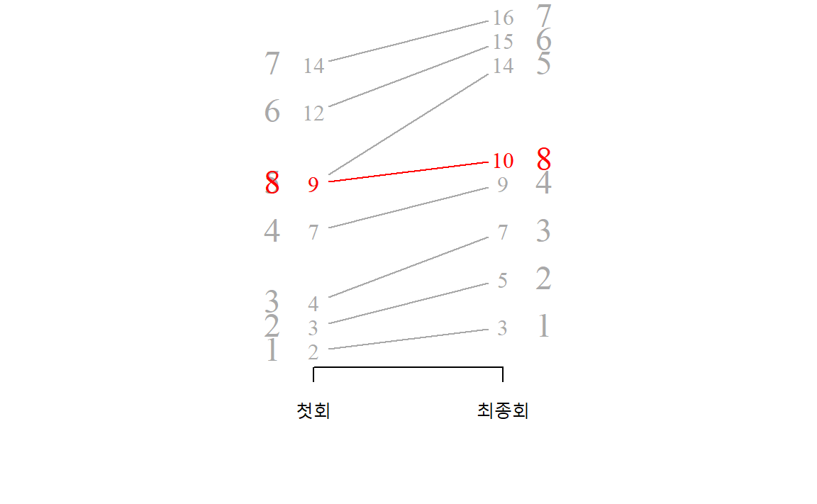
slopegraph() 함수 대신 ggslopegraph() 함수를 사용하게 되면 ggplot()으로도 시각화를 할 수 있다.
slopegraph() 함수는 자료구조가 직관적이라 처음 시각화를 하는 분에게 적절한 듯 보인다.
따라서, 앞서 ggplot 기반 경사그래프를 제작하고자 하는 경우 ggslopegraph()을 통해서도 ggplot 나머지 기능을 그대로 적용 가능하다.
ratings_dumbbell_df %>%
  pivot_wider(names_from = episode, values_from = viewers_7day) %>%
  as.data.frame() %>%
  column_to_rownames(var="series") %>%
  ggslopegraph(offset.x = 0.06, yrev = FALSE,
               col.lines = series_cols, col.lab = series_cols) +
    theme_minimal(base_family = "NanumGothic") +
    labs(title = "경사그래프 사례 - ggplot")